PLACES
Little Sister
Business Type: [NOW CLOSED] Coffee and Ice Cream Shop
Location: Portstewart, Co Derry, UK
Website: Instagram
Design Partner: Angel & Anchor
Category: Places
Photography: @wearelostfound
Little Sister presents a unique North Coast experience in Northern Ireland, catering to all, from connoisseurs savoring specialty coffee to little ones relishing big soft-serve flavors.
In a conversation with Ben Connolly, the visionary behind the design studio Angel & Anchor, we delve into the creative journey and conceptualization of Little Sister, an erstwhile gem nestled in Portstewart, Co Derry, UK.
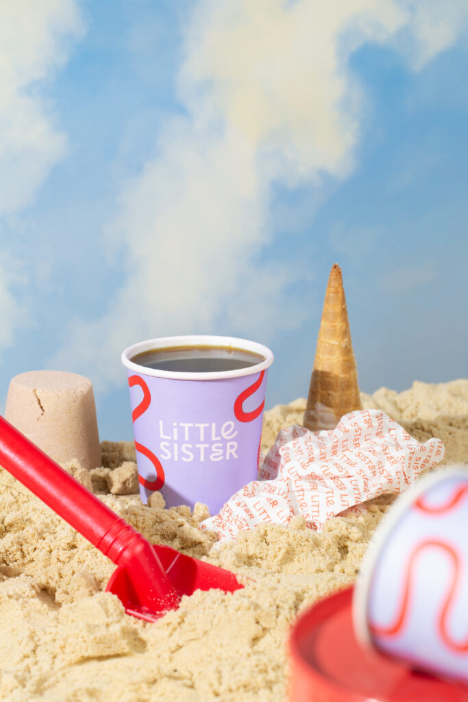
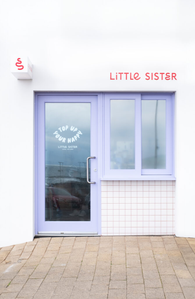

Designing Little Sister: A Creative Insight into Portstewart’s Whimsical Ice Cream Haven
Founders’ Background and Vision: David Lynas and his wife Emily, co-owners of the Lost & Found cafés in Portstewart and Coleraine collaborated with Belfast-based studio Angel and Anchor for their rebrand in 2019 and, later in 2022, for the birth of their North Coast counterpart, Little Sister. Seeking a brand harmonious with Lost & Found but possessing its own character, the idea of a takeaway hatch offering specialty coffee and soft-serve ice cream emerged.
Community Reception and Recognition: Little Sister garnered attention from various quarters, earning accolades from renowned publications like Image Magazine and Creative Boom, which praised its unique interior design and creative ambiance.
Space Build-Out and Design Features: The creative scope centered on art direction, influencing the shop’s fit-out and guiding other visual choices. This direction played a pivotal role in details like tiles, signage, and surface colors, instantly evoking a vibrant and playful personality. Inspired by classic ice cream parlors, specialty cafe culture, and modern editorial product photography, the interiors adopted a fresh, minimalist design as Little Sister’s signature flair
Brand Identity and Design Process:
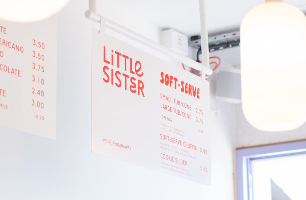
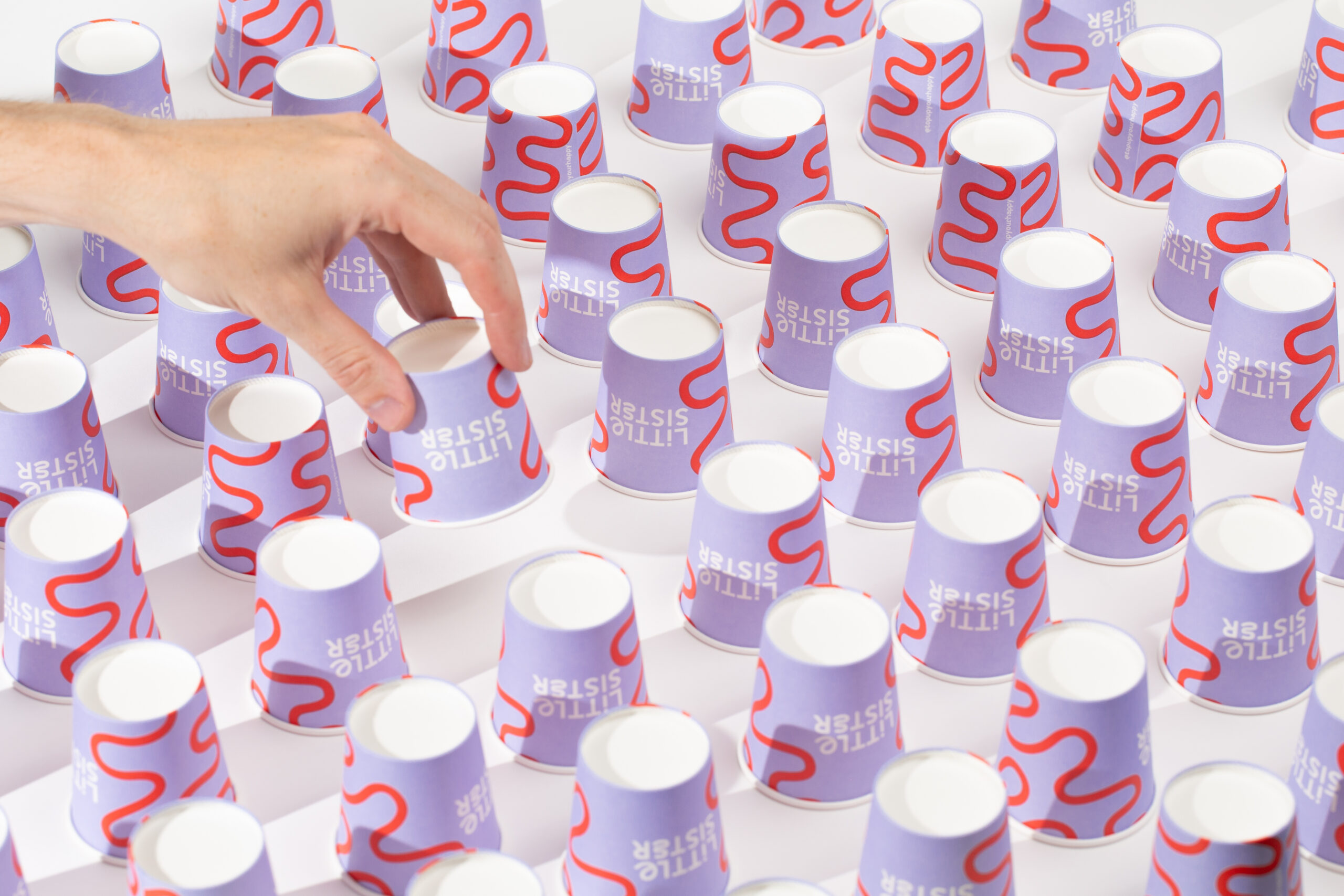
The brand identity flows through the details of the space. Parma violet purple, light peach, and bright mailbox red are a sweet but punchy combination of colors for Little Sister’s palette. Colors splash the walls, contrasting grout with tiles, and a bright coffee machine dips the shop into an upbeat personality.
Little Sister’s custom mixed-case logotype combines a minimalist sans serif with swirling letterforms. The round open curves inspired by children’s handwriting paired with straightforward type create a playful nod to Lost & Found’s approach to their new project. The curly ‘E’s’ composed of flowing curves interrupting the tall sans serif’s uniformity give the brand the same air of mischief we often see in young kids. The playful hints throughout the brand carry Little Sister into a category of family-friendly fun. Alongside the logotype, alternative bubbly, inflated hand-drawn lettering serves as a cheerful dose of personality used throughout signage and packaging. A pairing body copy in a monospace style allows for an approachable and relaxed nature, whether detailing soft serve flavors of the day or shop opening hours.
Little Sister’s logo mark is an abstract swirl inspired by the north coast ocean waves, winding country roads, and soft serve ice cream swirls. The custom mark echoes the shape of the custom ‘E’ in the logotype with extended curves, becoming an illustrative motif for the brand, used across packaging and signage.

Leave a Reply